Media Design and Development
The development domain includes preparing the instructional materials and experiences based on decisions made during design. The instructional technologist utilizes theory, research, and experience to combine various media in relevant and meaningful ways.
These projects were designed for print or the Web. The first three projects are food-themed and aimed at adults who buy food for their families. These projects are intended to help them make better—healthier, friendlier—food choices.
Job Aid--"What's in Season?"
- Audience: People who buy food
- Medium: Print
Overview
 The intended audience of this job aid is
adults who buy food for themselves and
their families. The purpose of the job aid is
to provide timely and relevant information for buying vegetables and fruits.
Seasonal vegetables and fruits taste better and cost less than produce that is shipped from another state or country. This guide shows when many common vegetables and fruit are in season in Northern California. The reverse side shows the recommended weekly amounts of fruits and vegetables (in subgroups based on nutritional elements) by gender and age. The size is 2” x 7” which, when folded in half, is the same size as a business card, making the aid convenient to carry.
Trifold--"The Nutrition Facts Label"
- Audience: People who buy food
- Medium: Print
Overview
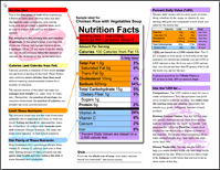
 The intended audience of this brochure is
adults who buy food for themselves and
their families. The purpose of the brochure
is to help them:
- to read and understand the Nutrition Facts label, and
- to use that information to make good food choices.
I began with a clear idea of how I wanted the inside of the brochure to look. I wanted to fill all three panels with an annotated illustration of a nutrition facts label. For the outside, I wanted a front panel that was eye-catching but also clear about the purpose of the brochure. I wanted the inside panel to provide a general introduction to the nutrition facts label. I decided that the back panel was the appropriate place for a list of facts related to the main content.
Info Graphic--"Support Your Local Farmer "
- Audience: People who buy food
- Medium: Print
Overview
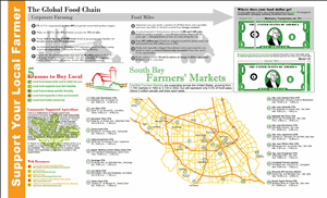
 The intended audience of this information
graphic is adults who buy food for themselves
and their families. The purpose of the
presentation is to persuade them to buy
from their local farmers’ markets.
The facts and figures presented cover:
- the rapid growth of corporate farming
and monopoly of supermarket shelves - the globalization of the food chain
- the resources required to transport food around the world
- the distribution of profits from food
- reasons to buy locally grown food
- locations and times of farmers’ markets
- more resources on the Web
In general I use color and graphic style to distinguish between the negative and positive information. The negative information is black and gray with straight lines and hard edges. The positive information takes its cues from the drawing of the small farm, which is primarily composed of red and green calligraphic lines.
Job Aid--"Thoracic Exercises "
- Audience: Thoracic patients
- Medium: Print
Problem
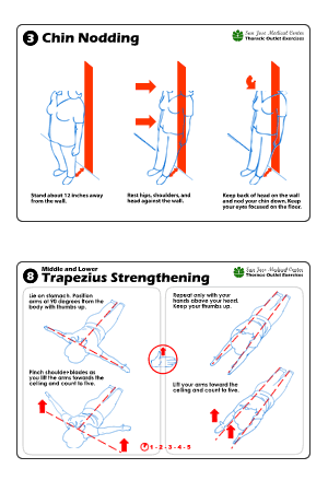
 Patients don’t understand the current handout. The handout is poorly written and doesn’t take into consideration that most of the San Jose Medical Center patients are ESL learners and speak either Spanish or Vietnamese.
Considerations
Patients first learn the exercises from physical therapists. Therefore they don’t need instruction, just an aid to remind them how to perform the exercises. On the current handout, the exercises are numbered; however, I’m not sure if they need to be done in that order.
Decisions
Because the majority of patients are ESL learners, I decided to use graphics as much as possible and keep text to a minimum. I thought about translating the directions into Spanish and Vietnamese, but that would have required too much space (and a translation service). I considered using photos but opted for line drawings, which allowed me to avoid extraneous details and focus on the key elements.
I chose a 4” x 6” format and printed the prototypes on photo paper. I would have the final aids printed on glossy, durable stock so that they would hold up under repeated use. Because other SJMC exercise programs may adopt this format, I put the name of the exercise group in the top right along with the SJMC logo and text.
Course Web Site for EDIT 271
- Audience: Instructional design students
- Medium: Web
Overview
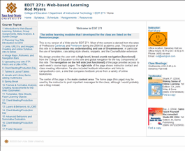
 This is my version of a Web site for EDIT 271. Most of the content is derived from the sites of Professors Cardenas and Pembrook during the 2004-05 academic year. The purpose of this site is to demonstrate my understanding and use of Dreamweaver, in particular the use of templates, Cascading Style Sheets, snippets, and the CourseBuilder extension.
My design uses CSS for page layout and design and degrades well for older browsers and other access devices. It provides the user with a high-level, bread-crumb navigation from the College of Education to this site and global navigation for the key components of this site. The navigation on the left side [not functional] of the page provides access to each week's course topic pages. The right side of the page shows instructor contact and class meeting information. I've also included textbook information and links to campusbooks.com, a site that compares textbook prices from a variety of online bookstores.
The center of the page is the main content area. The home page may be used by the instructor to post important messages for the class, although I would probably use a blog instead.