Position the Elements on the Page
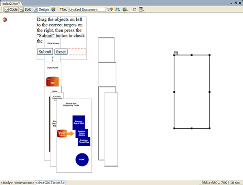
Now you're ready to position all of the drag and target elements on the page. Each element is in a layer on the page. You can see the layers by selecting Window > Layers from the Dreamweaver menubar. Even though the layers overlap now, once you drag one to position it on the page you won't be able to drag it over another layer. Given the number of layers you're working with, this can make it a little tricky to position everything.
Begin by dragging the target elements (the empty boxes) to the right side of the page. The target elements should be arranged in the following order: Target2, Target3, Target5, Target4, Target1. The order of the drag elements doesn't matter.

To drag an element, first click on it to select it. A little "handle" will appear in the upper-left corner. Click and hold down on the handle to drag the element. Be sure to use the handle! If you click inside the element and try to drag it, you're actually trying to drag the image inside the element. That will cause all sorts of problems. If you accidentally drag an image outside its element container, simply undo your action: Edit > Undo (action).
You can use your computer's arrow keys to nudge an element into place. Again, make sure you click on the element handle before using the arrow keys to move it. If you click inside the element, you will be moving the image, not the element. In the Properties frame you can see the pixel values for the element; use this to position all of the elements so they are horizontally aligned. The "T" property is the top position of the element.

One of the elements on the page was automatically created when the interaction was inserted into the page. This element has some basic text instructions and Submit and Reset buttons. Select this element and click on its handle. Use the black squares around the border of the element to resize it, and use the handle to position it.
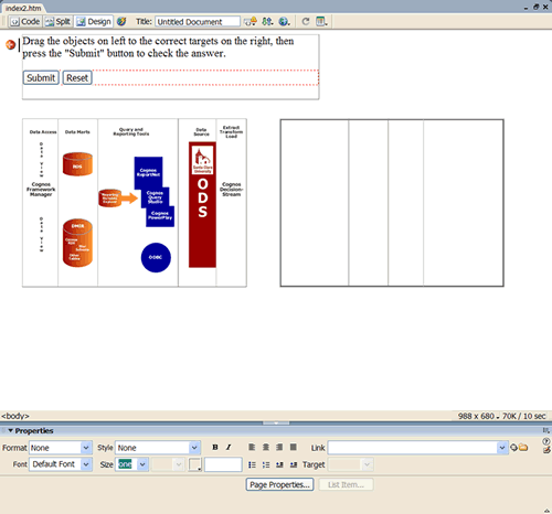
Once you've finished positioning everything on the screen, it should look something like this:

Save your work. Now open your page in Internet Explorer and try it. It should look something like this.
Because the drag elements and the target elements are all the same size, you'll notice that they can overlap when they're placed on the wrong targets. This can be a subtle clue to the user about where to drag elements. Keep this in mind when you design your drag-and-drop quizzes. It's probably better to keep all of the elements the same size if possible. There will be times when this isn't possible or desirable, for example, in a quiz that requires the user to drag the states into the proper place on a U.S. map.
